In the digital age, data is more than just numbers and charts; it’s a narrative that can drive decisions and shape the future of your business. At AXSOS AG, we believe in the power of data storytelling and how it can transform your business intelligence strategy. This blog post will explore how to effectively tell your data story your way, using interactive data visualizations that make complex information compelling and accessible.
The Power of Data Storytelling
Data storytelling is the art of communicating insights through a blend of data, visuals, and narrative. It’s not just about presenting numbers—it’s about creating a story that resonates with your audience. By telling your data story in a way that aligns with your organization’s goals and industry context, you can make complex topics more engaging and accessible.
- Why It Matters: A compelling data story can help your team and stakeholders understand the significance of the data, leading to quicker and more informed decision-making.
- Questions to Consider: Are you effectively communicating your data insights? How can data storytelling improve your decision-making processes?
Bringing Your Data to Life with Visualizations
Visualizations are the backbone of data storytelling. They transform raw data into something that can be easily understood and acted upon. Stunning, interactive visualizations tailored to your organization’s needs can make a significant impact by highlighting key insights and trends that might otherwise go unnoticed.
Making Complex Topics Compelling and Accessible
One of the greatest challenges in data storytelling is making complex topics understandable. By anchoring your narrative to well-constructed data visualizations, you can share insights more effectively. This approach not only increases comprehension but also helps your audience retain the information longer, leading to faster and better decision-making.
- Effective Techniques: Use interactive dashboards and real-time data to keep your audience engaged.
- Questions to Consider: Are your data presentations clear and accessible? How can better data visualizations help your audience make quicker decisions?
See Data Visuals in Action
The impact of data visualization is best understood by seeing it in action. Imagine transforming complicated information into easy-to-understand, interactive images that depict critical metrics for your business. These visuals can be tailored to show everything from financial health to customer satisfaction, providing a comprehensive view of your business at a glance.
Practical Example: Team Workload Analysis – The Power of Data Storytelling in Practice
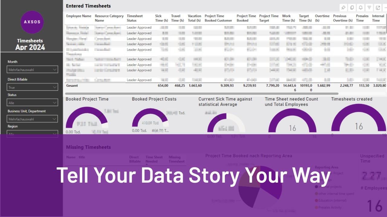
To illustrate the powerful impact of data storytelling in decision-making, let’s consider a typical team workload analysis. Imagine a team that frequently complains about being overburdened and believes that hiring additional staff is urgently needed. By using a dashboard that visualizes the use of working hours, we can take a closer look at the situation.

The dashboard divides the team’s working time into various categories: absences (vacation, sick leave) and working hours (client projects, internal meetings, internal projects, and training). Here are two possible scenarios that such an analysis could reveal:
Case 1: Confirming Overload Due to High Client Project Hours
In this scenario, the dashboard shows that the team spends over 80% of their regular working hours on billable client projects. This high workload leaves little room for internal projects, training, or recovery. Such an analysis would clearly indicate that the team is indeed overburdened, and expanding capacity by hiring new staff is urgently needed to maintain work quality and prevent burnout.
Case 2: Need for a Review of Meeting Culture
In another scenario, the dashboard shows that the team spends 60% of their working hours on billable client projects, while 30% of the time goes into internal meetings and 10% into training. In this case, the data analysis suggests that expanding capacity might not be the first solution. Instead, it could be more effective to review the efficiency of the meeting culture. The data suggests that internal meetings consume a significant portion of working time. A review of these meetings might show that optimizing or reducing them could free up more time for client projects and training without the need to hire additional staff.
Conclusion: Making Data-Driven Decisions
This example illustrates how a well-designed dashboard and clear data storytelling can lead to different recommendations for action. In the first case, increasing the team size would be the logical consequence, while in the second case, revising internal processes, particularly meeting culture, could be more efficient. Data storytelling allows complex relationships to be presented in a way that is both understandable and actionable. This transparency, combined with respectful communication, can then facilitate the change process and better guide the moderation with the affected employees.
- AXSOS AG’s Role: We provide professional services to help you create custom visualizations that bring your data story to life, ensuring it aligns with your business objectives.
- AXSOS AG’s Offerings: We enable your team to create these visualizations quickly and efficiently, leveraging a library of visuals and tools tested and approved for seamless integration.
Empower Your Business with Custom Visuals
Every business has unique data visualization needs. Whether you’re looking to track KPIs or present quarterly results, the right visualizations can make all the difference. By customizing your visuals, you can ensure that your data story is not only informative but also compelling and relevant to your audience.
- Customization Options: From standard charts to complex, interactive dashboards, you can tailor your visuals to fit your specific needs.
- Questions to Consider: Are your current data visualizations meeting your business needs? How can customized visuals enhance your business intelligence strategy?
Conclusion: Start Telling Your Data Story Today
At AXSOS AG, we believe that every business has a unique story to tell, and your data is a critical part of that narrative. By leveraging advanced data visualizations, you can tell your data story your way—making complex information accessible, engaging, and actionable. Whether you need help creating these visualizations or integrating them into your existing systems, our team is here to support you
Ready to transform your data into a compelling story?
- You want to master it yourself? Then join our PowerBI masterclass
- You want us to do it for you? Then let’s talk – book an appointment
- You want to know more? Then join our upcoming webinar or get more on our website
Join the Conversation:
- How are you currently telling your data story?
- What challenges do you face in making your data accessible and engaging?
- Share your experiences and thoughts in the comments below!